Accordion Text Blocks in Drupal
An “accordion tab” refers to a text element that organizes content into sections or tabs, where each tab can be expanded or collapsed to reveal or hide associated content. This is a great formatting option for compressing your text under a dropdown tab to conserve space on your page, while also containing your necessary information in a stylish way. It’s an especially good tool for mobile devices as the user doesn’t have to scroll and scroll and scroll to find the information they are looking for.
1. In your text block window, navigate to text block toolbar and select the Accordion icon (left of the capitalized “E” on the toolbar).
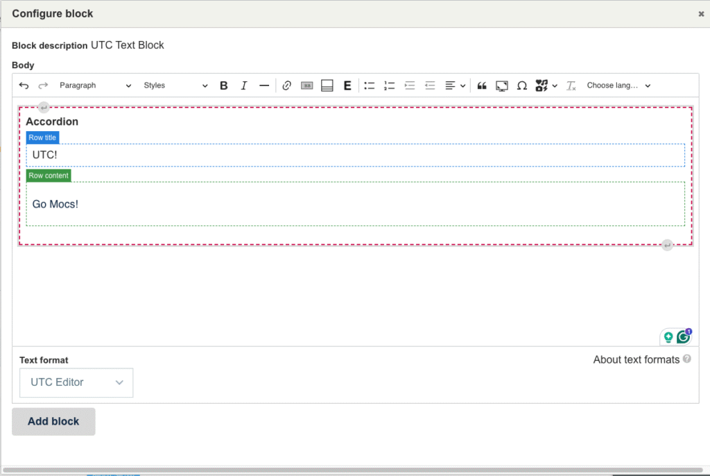
2. Once you select the Accordion icon, a template will appear in our block. This may look intimidating at first, but the template is made to be straightforward. You will see two boxes labeled “Row Title” and “Row Content”. As the names suggest, the “Row Title” is for your content title (like a subhead) and the “Row Content” is for the content body.
3. If you need more Accordion Tabs, you can add another by clicking anywhere in the accordion. A new edit menu will appear that allows you to add an accordion tab above, below, or remove an accordion tab.
4. When you are finished with your Accordion Tab, select the “Add Block” or “Update” option at the bottom of the text block menu.
One thing to note about accordions is that after you “Add block” or “Update” your block, the accordions won’t be activated. You will need to save your layout before you can see your accordion in action.
More information about UTC Text Blocks
Adding UTC Text Blocks to Content Page
Accordion Text Blocks in Drupal